Monday, March 15, 2010

Art walk: another look

last Saturday my friends and I revisited the art walk in Pomona. This time around I had the chance to see a different side of the art walk. we started out in the same place the DA gallery but headed in a different direction afterwards. This time around I was able to see many more of the smaller galleries. The galleries I saw were, were the DA, the Pomona frame house, Object gallery, Ferguson fine arts, Miramar longboards, Magic door IV, Metro gallery, and the downtown center gallery. It was a refreshing new look at the art walk. Even the few galleries that I revisited, had new exhibits up. I even had a chance to enjoy alittle music and walk through the small swap meet at Tomas plaza. I underestimated the volume of art that was available at the art walk. I have been there twice now and have yet see all of the galleries. Even if i went to all of the galleries in one night, another trip would be completely different. I would still see new art simply because the galleries are always changing. This gives each trip to the Pomona art walk its own style and flavor, becoming new experience every time.

Here are some photos of the galleries i went to.


The DA Gallery


Furgeson Fine Art and Gallery


Thomas Plaza


Mirimar Longboards


Pomona Downtown center


Saturday, March 13, 2010

"Placing" and "Curating"

"Placing" and "Curating"

This is the layout for the space that I Will be placing art work in.


The art space that I am working in, is the main living area of my apartment. The living room kitchen and dining room are connected together into one big room. In the diagram of the layout the pieces of art are represented by green rectangles. All but one of these pieces of art are hung on the wall. Number 3 is a chess set, which sits on a table, I will explain it later.
The theme of this placement is "everything in its place". The art works might not be connected or related, but they do belong in the space that they are placed. The functions of the space bring the art together, into a comfortable living environment.


The first piece of art is a movie poster, from the movie The Fifth Element. This might not be considered an explicit work of art but it can be use, in a space like this, as art. The poster is placed next to the TV and above the library of movies. The reason I chose a movie poster is that we watch many movies at my apartment. The reason I chose this specific poster is because, this is my favorite movie.

Art work number 2 sits on the wall across from the TV. It is a very large and empty wall so i felt the best type of art would be a landscape portrait. The hammock on a beach is supposed to give a felling of relaxation to those who look at it. When placed on this wall you can see the picture from anywhere in the living space. This gives a more relaxed feel to the house. Also its placed above the couch because the couch is the most comfortable place to take a nap.


The third and forth art works go together. The third is a set of Lewis chessmen, and the Fourth is a panting called the illusion chess board. They are placed in a corner of the room which makes them unobtrusive, but still conversational pieces. I saw the original Lewis chess set in a museum in England. I found the Lewis chess set to be an amazing work of art, due to the expert craftsmanship put in to creating it. It is interesting to know that it was made during the time of viking invasions in England. The poster called the illusion chess board goes hand in had with a chess set. looking at the poster you can't tell whether it shows the top of the board or the bottom
of the board. The scene in the poster is one of strategy and confusion, and if you have ever placed a chess game it can seem like controlled chaos. The reason I chose to put these art pieces in this quiet corner is that, my Friends and i have recently begun playing chess as a common pass time. We have a need for a good chess board and a poster exemplifying what type of game chess is, adds a nice touch.



art work number 5 is a picture of breakfast. I'm not sure where it comes from but it looks delicious. This picture fits perfectly in the kitchen. I chose a picture of breakfast for two reasons. One breakfast is the most important meal of the day. And two breakfast is my favorite meal of the day.


art work number 6 is a painting called carpe diem. It shows a picture of airplanes with the words carpe diem displayed in the center. Carpe diem in Latin means seize the day. This is intended to be a motivational painting. I placed it on the wall behind my desk so that it will inspire me to study harder. The fact that it has airplanes on it i a very nice touch because my major is aerospace engineering.


Although there is no major theme that can directly connect all of the art works together. Each piece of art does have its own place and functionality. They are placed there for specific reasons, not one grand design, this makes the theme simply "everything in its place".


Monday, February 15, 2010

Norton Simon museum: still life


A trip to the Norton Simon museum is worth taking. The museum has a large and impressive collection art. There were so many thing to see, that you could write a book describing all of them. One thing that i took notice of was the various forms of still art. I was amazed at the details , and variety of still art. I didn't know that the interpretation of still art had so many views. I thought still art had to be a strait forward realistic representation. Some were near perfect drawings, while others had an abstract view. The abstract paintings didn't lose any meaning or effectiveness, they merely described it in an alternative way.

Still life c. 17 65


Henri-horace roland de la porte


French 1724-1793


oil on canvas


Still Life with Rummer 1645 or 1648

Pieter Claesz

Dutch 1590/93-1632/39

oil on panel


Still Life with Lemmons Oranges and a Rose 1633

Francisco de Zurbian

Spanich 1598-1664

oil on canvus


The three of these painting were the best still art paintings i had ever seen. The thing that struck me the most was how they painted clear glass. In still life with rummer i thought i was looking at a photo because the glass looked so real. Another interesting of these is the detail in the fruit. It almost looks like you can reach in and pick up a lemon, from still life with lemons. I feel that what helps set these apart is the use of light and shadow. Having a light source shining from the left in Still life with lemons gives it a 3D feel.


Still Life #2 1962

Tom Wesselmann


American 1932-2004

oil and collage board


Still life 1884

Vincent van Gogh

Dutch, 1853-1890

oil on canvas


What Is Hot

The second Saturday its self was "hot". Out of all the art events in the area, this one had the most notoriety. It is hard to look at something and say that it is hot, or it is the next new thing, or even it is the best of its time. A way of gaining insight to help determine whether it is hot or not is, to go out and see where the people are, what they are buying, and what they are spending time to appreciate.


Under the first category of where people are at, the DA gallery stood out as the hottest. It had a steady flow of people stepping in to admire the art. the DA was featuring a collection of art under the theme of, The New Traditionalists. The new traditionalist theme seems to be a hot topic for art, because several other galleries had similar paintings to the ones were featured at the DA gallery.

One set of these commons paintings were, paintings done by an artist named Yolanda Gonzales. Many or her paintings were featured in several galleries, and seemed to be very popular. I wondered why these paintings were so popular. After some discussion and a little bit of thought I came up with a hypothesis. I felt that they took a new view on traditional portraits. They were not perfect portraits, but the had the proper portions and definitions of facial features. It is almost as if they took a classical style portrait, but they are painted in a modern style.


from left to right

Sueno de Jennifer $12,000

Bailarina Folklorico $5,000

Portrait of Lauren with crown of roses

$9,000


top row left

Sueno de Alicia $12,000

Sueno with eyes closed $12,000

bottom row

Nude 1-4 $1,000 each

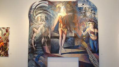
Price is the third category that can help define hot. Out of all the art i saw the most expensive one was Birth of The New Consciousness by Leslie A. Brown. The painting was selling for $28,000 dollars. The size of the painting might have contributed to its price, but its hard to tell because there were no other paintings of comparable size. Other works form this artist were also expensive, so it might just be that Brown is the hot thing right now. the quality of the panting its self is amazing. The Painting is filled with many details and and abstract symbols, that allow the mind to wander and find its own meaning.


Art Walk

Second Saturday at the Pomona Arts Colony


The second Saturday art walk in Pomona was the hot spot of art for the evening. There where many galleries open, and available for viewing. Curators and artists mingled among the visitors to help answer questions about the art. Free drinks and snacks helped to keep people viewing the paintings longer. and the galleries were open late. All of the is was an attempt to sell art, and have the artists gain more renown.

I was among one of the many people at the art walk. i did not have a chance to see all of the galleries but the few i did see were very enjoyable. I visited the Da gallery, the Pomona Frame House Main Street Gallery, the Latino art Museum, the 57 Underground gallery,and the Object Gallery.
DA gallery
the Frame House
the Latino art Museum
57 Underground Gallery
the Object gallery